ADS

Top Banner Advertisement
  • New features to better understand player behavior with Player Analytics.

  • Find success on Google Play: What app developers can learn from games .

  • Using Credentials between your Server and Google Services.

New Post

Rss

Showing posts with label archive. Show all posts
Monday, May 25, 2015
Game Performance: Geometry Instancing

Game Performance: Geometry Instancing

Posted by Shanee Nishry, Games Developer Advocate


Imagine a beautiful virtual forest with countless trees, plants and vegetation, or a stadium with countless people in the crowd cheering. If you are heroic you might like the idea of an epic battle between armies.


Rendering a lot of meshes is desired to create a beautiful scene like a forest, a cheering crowd or an army, but doing so is quite costly and reduces the frame rate. Fortunately this is possible using a simple technique called Geometry Instancing.


Geometry instancing can be used in 2D games for rendering a large number of sprites, or in 3D for things like particles, characters and environment.


The NDK code sample More Teapots demoing the content of this article can be found with the ndk inside the samples folder and in the git repository.


Support and Extensions


Geometry instancing is available from OpenGL ES 3.0 and to OpenGL 2.0 devices which support the GL_NV_draw_instanced or GL_EXT_draw_instanced extensions. More information on how to using the extensions is shown in the More Teapots demo.


Overview


Submitting draw calls causes OpenGL to queue commands to be sent to the GPU, this has an expensive overhead which may affect performance. This overhead grows when changing states such as alpha blending function, active shader, textures and buffers.


Geometry Instancing is a technique that combines multiple draws of the same mesh into a single draw call, resulting in reduced overhead and potentially increased performance. This works even when different transformations are required.


The algorithm


To explain how Geometry Instancing works let’s quickly overview traditional drawing.


Traditional Drawing


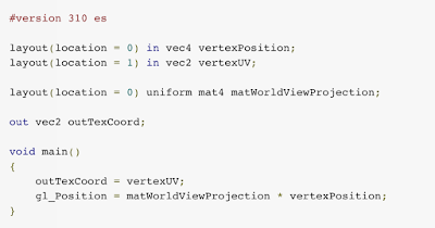
To a draw a mesh you’d usually prepare a vertex buffer and an index buffer, bind your shader and buffers, set your uniforms such as a World View Projection matrix and make a draw call.


To draw multiple instances using the same mesh you set new uniform values for the transformations and other data and call draw again. This is repeated for every instance.


Drawing with Geometry Instancing


Geometry Instancing reduces CPU overhead by reducing the sequence described above into a single buffer and draw call.


It works by using an additional buffer which contains custom per-instance data needed by your shader, such as transformations, color, light data.


The first change to your workflow is to create the additional buffer on initialization stage.


To put it into code let’s define an example per-instance data that includes a world view projection matrix and a color:


C++


struct PerInstanceData
{
Mat4x4 WorldViewProj;
Vector4 Color;
};


You also need to the structure to your shader. The easiest way is by creating a Uniform Block with an array:


GLSL


#define MAX_INSTANCES 512

layout(std140) uniform PerInstanceData {
struct
{
mat4 uMVP;
vec4 uColor;
} Data[ MAX_INSTANCES ];
};


Note that uniform blocks have limited sizes. You can find the maximum number of bytes you can use by querying for GL_MAX_UNIFORM_BLOCK_SIZE using glGetIntegerv.


Example:


GLint max_block_size = 0;
glGetIntegerv( GL_MAX_UNIFORM_BLOCK_SIZE, &max_block_size );


Bind the uniform block on the CPU in your program’s initialization stage:


C++


#define MAX_INSTANCES 512
#define BINDING_POINT 1
GLuint shaderProgram; // Compiled shader program

// Bind Uniform Block
GLuint blockIndex = glGetUniformBlockIndex( shaderProgram, "PerInstanceData" );
glUniformBlockBinding( shaderProgram, blockIndex, BINDING_POINT );


And create a corresponding uniform buffer object:


C++


// Create Instance Buffer
GLuint instanceBuffer;

glGenBuffers( 1, &instanceBuffer );
glBindBuffer( GL_UNIFORM_BUFFER, instanceBuffer );
glBindBufferBase( GL_UNIFORM_BUFFER, BINDING_POINT, instanceBuffer );

// Initialize buffer size
glBufferData( GL_UNIFORM_BUFFER, MAX_INSTANCES * sizeof( PerInstanceData ), NULL, GL_DYNAMIC_DRAW );


The next step is to update the instance data every frame to reflect changes to the visible objects you are going to draw. Once you have your new instance buffer you can draw everything with a single call to glDrawElementsInstanced.


You update the instance buffer using glMapBufferRange. This function locks the buffer and retrieves a pointer to the byte data allowing you to copy your per-instance data. Unlock your buffer using glUnmapBuffer when you are done.


Here is a simple example for updating the instance data:


const int NUM_SCENE_OBJECTS = …; // number of objects visible in your scene which share the same mesh

// Bind the buffer
glBindBuffer( GL_UNIFORM_BUFFER, instanceBuffer );

// Retrieve pointer to map the data
PerInstanceData* pBuffer = (PerInstanceData*) glMapBufferRange( GL_UNIFORM_BUFFER, 0,
NUM_SCENE_OBJECTS * sizeof( PerInstanceData ),
GL_MAP_WRITE_BIT | GL_MAP_INVALIDATE_RANGE_BIT );

// Iterate the scene objects
for ( int i = 0; i < NUM_SCENE_OBJECTS; ++i )
{
pBuffer[ i ].WorldViewProj = ... // Copy World View Projection matrix
pBuffer[ i ].Color = … // Copy color
}

glUnmapBuffer( GL_UNIFORM_BUFFER ); // Unmap the buffer


And finally you can draw everything with a single call to glDrawElementsInstanced or glDrawArraysInstanced (depending if you are using an index buffer):


glDrawElementsInstanced( GL_TRIANGLES, NUM_INDICES, GL_UNSIGNED_SHORT, 0,
NUM_SCENE_OBJECTS );


You are almost done! There is just one more step to do. In your shader you need to make use of the new uniform buffer object for your transformations and colors. In your shader main program:


void main()
{

gl_Position = PerInstanceData.Data[ gl_InstanceID ].uMVP * inPosition;
outColor = PerInstanceData.Data[ gl_InstanceID ].uColor;
}


You might have noticed the use gl_InstanceID. This is a predefined OpenGL vertex shader variable that tells your program which instance it is currently drawing. Using this variable your shader can properly iterate the instance data and match the correct transformation and color for every vertex.


That’s it! You are now ready to use Geometry Instancing. If you are drawing the same mesh multiple times in a frame make sure to implement Geometry Instancing in your pipeline! This can greatly reduce overhead and improve performance.


Wednesday, April 22, 2015
Game Performance: Explicit Uniform Locations

Game Performance: Explicit Uniform Locations

Posted by Shanee Nishry, Games Developer Advocate


Uniforms variables in GLSL are crucial for passing data between the game code on the CPU and the shader program on the graphics card. Unfortunately, up until the availability of OpenGL ES 3.1, using uniforms required some preparation which made the workflow slightly more complicated and wasted time during loading.


Let us examine a simple vertex shader and see how OpenGL ES 3.1 allows us to improve it:


#version 300 es

layout(location = 0) in vec4 vertexPosition;
layout(location = 1) in vec2 vertexUV;

uniform mat4 matWorldViewProjection;

out vec2 outTexCoord;

void main()
{
outTexCoord = vertexUV;
gl_Position = matWorldViewProjection * vertexPosition;
}


Note: You might be familiar with this shader from a previous Game Performance article on Layout Qualifiers. Find it here.


We have a single uniform for our world view projection matrix:


uniform mat4 matWorldViewProjection;


The inefficiency appears when you want to assign the uniform value.


You need to use glUniformMatrix4fv or glUniform4f to set the uniform’s value but you also need the handle for the uniform’s location in the program. To get the handle you must call glGetUniformLocation.


GLuint program; // the shader program
float matWorldViewProject[16]; // 4x4 matrix as float array

GLint handle = glGetUniformLocation( program, “matWorldViewProjection” );
glUniformMatrix4fv( handle, 1, false, matWorldViewProject );


That pattern leads to having to call glGetUniformLocation for each uniform in every shader and keeping the handles or worse, calling glGetUniformLocation every frame.


Warning! Never call glGetUniformLocation every frame! Not only is it bad practice but it is slow and bad for your game’s performance. Always call it during initialization and save it somewhere in your code for use in the render loop.


This process is inefficient, it requires you to do more work and costs precious time and performance.


Also take into consideration that you might have multiple shaders with the same uniforms. It would be much better if your code was deterministic and the shader language allowed you to explicitly set the locations of your uniforms so you don’t need to query and manage access handles. This is now possible with Explicit Uniform Locations.


You can set the location for uniforms directly in the shader’s code. They are declared like this


layout(location = index) uniform type name;


For our example shader it would be:


layout(location = 0) uniform mat4 matWorldViewProjection;


This means you never need to use glGetUniformLocation again, resulting in simpler code, initialization process and saved CPU cycles.


This is how the example shader looks after the change. Changes are marked in bold:


#version 310 es

layout(location = 0) in vec4 vertexPosition;
layout(location = 1) in vec2 vertexUV;

layout(location = 0) uniform mat4 matWorldViewProjection;

out vec2 outTexCoord;

void main()
{
outTexCoord = vertexUV;
gl_Position = matWorldViewProjection * vertexPosition;
}


As Explicit Uniform Locations are only supported from OpenGL ES 3.1 we also changed the version declaration to 310.


Now all you need to do to set your matWorldViewProjection uniform value is call glUniformMatrix4fv for the handle 0:


const GLint UNIFORM_MAT_WVP = 0; // Uniform location for WorldViewProjection
float matWorldViewProject[16]; // 4x4 matrix as float array

glUniformMatrix4fv( UNIFORM_MAT_WVP, 1, false, matWorldViewProject );


This change is extremely simple and the improvements can be substantial, producing cleaner code, asset pipeline and improved performance. Be sure to make these changes If you are targeting OpenGL ES 3.1 or creating multiple APKs to support a wide range of devices.


To learn more about Explicit Uniform Locations check out the OpenGL wiki page for it which contains valuable information on different layouts and how arrays are represented.


Thursday, March 26, 2015
Game Performance: Layout Qualifiers

Game Performance: Layout Qualifiers

Today, we want to share some best practices on using the OpenGL Shading Language (GLSL) that can optimize the performance of your game and simplify your workflow. Specifically, Layout qualifiers make your code more deterministic and increase performance by reducing your work.


Let’s start with a simple vertex shader and change it as we go along.


This basic vertex shader takes position and texture coordinates, transforms the position and outputs the data to the fragment shader:

attribute vec4 vertexPosition;
attribute vec2 vertexUV;

uniform mat4 matWorldViewProjection;

varying vec2 outTexCoord;

void main()
{
  outTexCoord = vertexUV;
  gl_Position = matWorldViewProjection * vertexPosition;
}

Vertex Attribute Index


To draw a mesh on to the screen, you need to create a vertex buffer and fill it with vertex data, including positions and texture coordinates for this example.


In our sample shader, the vertex data may be laid out like this:

struct Vertex
{
Vector4 Position;
Vector2 TexCoords;
};

Therefore, we defined our vertex shader attributes like this:

attribute vec4 vertexPosition;
attribute vec2 vertexUV;

To associate the vertex data with the shader attributes, a call to glGetAttribLocation will get the handle of the named attribute. The attribute format is then detailed with a call to glVertexAttribPointer.

GLint handleVertexPos = glGetAttribLocation( myShaderProgram, "vertexPosition" );
glVertexAttribPointer( handleVertexPos, 4, GL_FLOAT, GL_FALSE, 0, 0 );

GLint handleVertexUV = glGetAttribLocation( myShaderProgram, "vertexUV" );
glVertexAttribPointer( handleVertexUV, 2, GL_FLOAT, GL_FALSE, 0, 0 );

But you may have multiple shaders with the vertexPosition attribute and calling glGetAttribLocation for every shader is a waste of performance which increases the loading time of your game.


Using layout qualifiers you can change your vertex shader attributes declaration like this:

layout(location = 0) in vec4 vertexPosition;
layout(location = 1) in vec2 vertexUV;

To do so you also need to tell the shader compiler that your shader is aimed at GL ES version 3.1. This is done by adding a version declaration:

#version 300 es

Let’s see how this affects our shader, changes are marked in bold:

#version 300 es

layout(location = 0) in vec4 vertexPosition;
layout(location = 1) in vec2 vertexUV;


uniform mat4 matWorldViewProjection;

out vec2 outTexCoord;

void main()
{
  outTexCoord = vertexUV;
  gl_Position = matWorldViewProjection * vertexPosition;
}

Note that we also changed outTexCoord from varying to out. The varying keyword is deprecated from version 300 es and requires changing for the shader to work.


Note that Vertex Attribute qualifiers and #version 300 es are supported from OpenGL ES 3.0. The desktop equivalent is supported on OpenGL 3.3 and using #version 330.


Now you know your position attributes always at 0 and your texture coordinates will be at 1 and you can now bind your shader format without using glGetAttribLocation:

const int ATTRIB_POS = 0;
const int ATTRIB_UV = 1;

glVertexAttribPointer( ATTRIB_POS, 4, GL_FLOAT, GL_FALSE, 0, 0 );
glVertexAttribPointer( ATTRIB_UV, 2, GL_FLOAT, GL_FALSE, 0, 0 );

This simple change leads to a cleaner pipeline, simpler code and saved performance during loading time.


To learn more about performance on Android, check out the Android Performance Patterns series.


Posted by Shanee Nishry, Games Developer Advocate


Wednesday, February 18, 2015
Building for Android Wear: Depth and Flexibility

Building for Android Wear: Depth and Flexibility

Posted by Timothy Jordan, Developer Advocate


With so many recent updates and improvements to Android Wear, it's high time to share an updated overview of the platform. We're certainly not done—there's a lot more to come—but this is the picture today as you start or continue developing your groundbreaking Android Wear user experiences.


The Android Wear platform emphasizes depth and flexibility. Built on Android, it allows developers to use familiar APIs to create useful, performant, and imaginative apps that run directly on the watch. In the spirit of Android, you have the freedom to make substantial changes to the user experience, including the creation of custom watch faces. There are three main categories of experiences you can build: apps, custom watch faces, and notifications.


Apps


Apps that are built for Android Wear run directly on the watch and can do nearly anything a phone can, from tracking your run to giving you a little entertainment while waiting for the bus. Some even work without a connection to the phone, such as fitness and music apps. There are libraries to help you move data between the phone and the wearable, as well as create stunning and adaptable UIs. Here's a list of some of the great features you have access to:


Feature
Documentation
Full screen activities with touch eventsCreating Custom UIs for Wear Devices
Notifications and custom actionsUI Patterns for Android Wear
Custom Watch facesCreating Watch Faces
Layouts for round and square devicesCreating Custom UIs for Wear Devices
OpenGLDisplaying Graphics with OpenGL ES
Sensors
  • Accelerometer

  • Gyroscope

  • Compass

  • Barometer

  • Heart rate sensor
SensorManager
HapticsVibrator
MicrophoneAudioRecord
Voice actionsAdding Voice Capabilities
GPSDetecting Location on Android Wear
Offline storing of data / musicTransferring Assets
Media playback controlsMediaSession, MediaController
Framework based on Android 5.0 API 21Android 5.0 APIs
Standalone or synchronized appsSending and Syncing Data


Watch Faces


The ability to create custom watch faces gives you direct access to the most prominent UI element on a user's most personal device. The API is simple enough to build watch faces quickly and flexible enough to allow personalization. Again, given the depth and flexibility of the Android platform, you can create something for the user that's both beautiful and packed with unique features.


The development journey starts with the simplicity of bringing your design to the wrist. At the core of the watch face API is the onDraw method that allows you to draw whatever design you can think of to the canvas at a high enough frame rate to deliver fluid animation. This will come through at full fidelity while the watch is in interactive mode.


At other times, when the watch is in ambient mode, you're able to draw a more discreet version of the watch face. Additional preferences can be set to arrange the system UI elements appropriately for your design. Once those basics are covered, the limits are your imagination! You can go further with additions like the moon phase, current weather, or fitness stats. Watchmakers call these items "complications" -- but with Android they're hardly complicated. Once you have the data, just draw it on the canvas as you did the time.


Notifications


Of course, Android Wear Notifications are the easiest way to get started in the world of wearables. If you've got an Android app with notifications -- they already work on a Wear watch. If you've already enhanced your notification with actions, this is even better and also automatically already works. You can take things further with Wear-specific functionality like Stacks, Pages, and Voice Replies that make your notifications richer experiences on the wrist.


The user experiences you build for Wear get to take advantage of the power and flexibility of the Android platform. It's easy to get started and possible to create truly groundbreaking UI for your users. Together, we can create an ecosystem of user experiences as diverse as the watches they run on and the people who wear them.


Check out the developer videos and documentation for more, and share your thoughts on the Android Wear Developers community. We can’t wait to see the innovative user experiences you will build on Android Wear.


Monday, March 30, 2009
Android Layout Tricks #3: Optimize with stubs

Android Layout Tricks #3: Optimize with stubs

Sharing and reusing layouts is very easy with Android thanks to the <include /> tag, sometimes even too easy and you might end up with user interfaces that contain a large number of views, some of which are rarely used. Thankfully, Android offers a very special widget called ViewStub, which brings you all the benefits of the <include /> without polluting your user interface with rarely used views.

A ViewStub is a dumb and lightweight view. It has no dimension, it does not draw anything and does not participate in the layout in any way. This means a ViewStub is very cheap to inflate and very cheap to keep in a view hierarchy. A ViewStub can be best described as a lazy include. The layout referenced by a ViewStub is inflated and added to the user interface only when you decide so.

The following screenshot comes from the Shelves application. The main purpose of the activity shown in the screenshot is to present the user with a browsable list of books:

The same activity is also used when the user adds or imports new books. During such an operation, Shelves shows extra bits of user interface. The screenshot below shows the progress bar and cancel button that appear at the bottom of the screen during an import:

Because importing books is not a common operation, at least when compared to browsing the list of books, the import panel is originally represented by a ViewStub:

When the user initiates the import process, the ViewStub is inflated and replaced by the content of the layout file it references:

To use a ViewStub all you need is to specify an android:id attribute, to later inflate the stub, and an android:layout attribute, to reference what layout file to include and inflate. A stub lets you use a third attribute, android:inflatedId, which can be used to override the id of the root of the included file. Finally, the layout parameters specified on the stub will be applied to the roof of the included layout. Here is an example:

<ViewStub
android:id="@+id/stub_import"
android:inflatedId="@+id/panel_import"

android:layout="@layout/progress_overlay"

android:layout_width="fill_parent"
android:layout_height="wrap_content"
android:layout_gravity="bottom" />

When you are ready to inflate the stub, simply invoke the inflate() method. You can also simply change the visibility of the stub to VISIBLE or INVISIBLE and the stub will inflate. Note however that the inflate() method has the benefit of returning the root View of the inflate layout:

((ViewStub) findViewById(R.id.stub_import)).setVisibility(View.VISIBLE);
// or
View importPanel = ((ViewStub) findViewById(R.id.stub_import)).inflate();

It is very important to remember that after the stub is inflated, the stub is removed from the view hierarchy. As such, it is unnecessary to keep a long-lived reference, for instance in an class instance field, to a ViewStub.

A ViewStub is a great compromise between ease of programming and efficiency. Instead of inflating views manually and adding them at runtime to your view hierarchy, simply use a ViewStub. It's cheap and easy. The only drawback of ViewStub is that it currently does not support the <merge /> tag.

Happy coding!

Thursday, March 5, 2009
no image

Window Backgrounds & UI Speed

Some Android applications require to squeeze every bit of performance out of the UI toolkit and there are many ways to do so. In this article, you will discover how to speed up the drawing and the perceived startup time of your activities. Both these techniques rely on a single feature, the window's background drawable.

The term window background is a bit misleading however. When you setup your user interface by calling setContentView() on an Activity, Android adds your views to the Activity's window. The window however does not contain only your views, but a few others created for you. The most important one is, in the current implementation used on the T-Mobile G1, the DecorView, highlighted in the view hierarchy below:

A typical Android view hierarchy

The DecorView is the view that actually holds the window's background drawable. Calling getWindow().setBackgroundDrawable() from your Activity changes the background of the window by changing the DecorView's background drawable. As mentioned before, this setup is very specific to the current implementation of Android and can change in a future version or even on another device.

If you are using the standard Android themes, a default background drawable is set on your activities. The standard theme currently used on the T-Mobile G1 uses for instance a ColorDrawable. For most applications, this background drawable works just fine and can be left alone. It can however impacts your application's drawing performance. Let's take the example of an application that always draws a full screen opaque picture:

An opaque user interface doesn't need a window background

You can see on this screenshot that the window's background is invisible, entirely covered by an ImageView. This application is setup to redraw as fast as it can and draws at about 44 frames per second, or 22 milliseconds per frame (note: the number of frames per second used in this article were obtained on a T-Mobile G1 with my finger on the screen so as to reduce the drawing speed which would otherwise be capped at 60 fps.) An easy way to make such an application draw faster is to remove the background drawable. Since the user interface is entirely opaque, drawing the background is simply wasteful. Removing the background improves the performance quite nicely:

Remove the background for faster drawing

In this new version of the application, the drawing speed went up to 51 frames per second, or 19 milliseconds per frame. The difference of 3 milliseconds per is easily explained by the speed of the memory bus on the T-Mobile G1: it is exactly the time it takes to move the equivalent of a screenful of pixels on the bus. The difference could be even greater if the default background was using a more expensive drawable.

Removing the window's background can be achieved very easily by using a custom theme. To do so, first create a file called res/values/theme.xml containing the following:

<resources>
<style name="Theme.NoBackground" parent="android:Theme">
<item name="android:windowBackground">@null</item>
</style>
</resources>

You then need to apply the theme to your activity by adding the attribute android:theme="@style/Theme.NoBackground" to your <activity /> or <application /> tag. This trick comes in very handy for any app that uses a MapView, a WebView or any other full screen opaque view.

Opaque views and Android: this optimization is currently necessary because the Android UI toolkit is not smart enough to prevent the drawing of views hidden by opaque children. The main reason why this optimization was not implemented is simply because there are usually very few opaque views in Android applications. This is however something that I definitely plan on implementing as soon as possible and I can only apologize for not having been able to do this earlier.

Using a theme to change the window's background is also a fantastic way to improve the perceived startup performance of some of your activities. This particular trick can only be applied to activities that use a custom background, like a texture or a logo. The Shelves application is a good example:

Textured backgrounds are good candidates for window's background

If this application simply set the wooden background in the XML layout or in onCreate() the user would see the application startup with the default theme and its dark background. The wooden texture would only appear after the inflation of the content view and the first layout/drawing pass. This causes a jarring effect and gives the user the impression that the application takes time to load (which can actually be the case.) Instead, the application defines the wooden background in a theme, picked up by the system as soon as the application starts. The user never sees the default theme and gets the impression that the application is up and running right away. To limit the memory and disk usage, the background is a tiled texture defined in res/drawable/background_shelf.xml:

<bitmap xmlns:android="http://schemas.android.com/apk/res/android"
android:src="@drawable/shelf_panel"
android:tileMode="repeat" />

This drawable is simply referenced by the theme:

<resources>
<style name="Theme.Shelves" parent="android:Theme">
<item name="android:windowBackground">@drawable/background_shelf</item>
<item name="android:windowNoTitle">true</item>
</style>
</resources>

The same exact trick is used in the Google Maps application that ships with the T-Mobile G1. When the application is launched, the user immediately sees the loading tiles of MapView. This is only a trick, the theme is simply using a tiled background that looks exactly like the loading tiles of MapView.

Sometimes the best tricks are also the simplest so the next time you create an activity with an opaque UI or a custom background, remember to change the window's background.

Download the source code of the first example.

Download the source code of Shelves.

Tuesday, March 3, 2009
no image

Android Layout Tricks #3: Optimize by merging

In the previous installment of Android Layout Tricks, I showed you how to use the <include /> tag in XML layout to reuse and share your layout code. I also mentioned the <merge /> and it's now time to learn how to use it.

The <merge /> was created for the purpose of optimizing Android layouts by reducing the number of levels in view trees. It's easier to understand the problem this tag solves by looking at an example. The following XML layout declares a layout that shows an image with its title on top of it. The structure is fairly simple; a FrameLayout is used to stack a TextView on top of an ImageView:

<FrameLayout xmlns:android="http://schemas.android.com/apk/res/android"
android:layout_width="fill_parent"
android:layout_height="fill_parent">

<ImageView
android:layout_width="fill_parent"
android:layout_height="fill_parent"

android:scaleType="center"
android:src="@drawable/golden_gate" />

<TextView
android:layout_width="wrap_content"
android:layout_height="wrap_content"
android:layout_marginBottom="20dip"
android:layout_gravity="center_horizontal|bottom"

android:padding="12dip"

android:background="#AA000000"
android:textColor="#ffffffff"

android:text="Golden Gate" />

</FrameLayout>

This layout renders nicely as we expected and nothing seems wrong with this layout:


A FrameLayout is used to overlay a title on top of an image


Things get more interesting when you inspect the result with HierarchyViewer. If you look closely at the resulting tree you will notice that the FrameLayout defined in our XML file (highlighted in blue below) is the sole child of another FrameLayout:

A layout with only one child of same dimensions can be removed

Since our FrameLayout has the same dimension as its parent, by the virtue of using the fill_parent constraints, and does not define any background, extra padding or a gravity, it is totally useless. We only made the UI more complex for no good reason. But how could we get rid of this FrameLayout? After all, XML documents require a root tag and tags in XML layouts always represent view instances.

That's where the <merge /> tag comes in handy. When the LayoutInflater encounters this tag, it skips it and adds the <merge /> children to the <merge /> parent. Confused? Let's rewrite our previous XML layout by replacing the FrameLayout with <merge />:

<merge xmlns:android="http://schemas.android.com/apk/res/android">

<ImageView
android:layout_width="fill_parent"
android:layout_height="fill_parent"

android:scaleType="center"
android:src="@drawable/golden_gate" />

<TextView
android:layout_width="wrap_content"
android:layout_height="wrap_content"
android:layout_marginBottom="20dip"
android:layout_gravity="center_horizontal|bottom"

android:padding="12dip"

android:background="#AA000000"
android:textColor="#ffffffff"

android:text="Golden Gate" />

</merge>

With this new version, both the TextView and the ImageView will be added directly to the top-level FrameLayout. The result will be visually the same but the view hierarchy is simpler:

Optimized view hierarchy using the merge tag

Obviously, using <merge /> works in this case because the parent of an activity's content view is always a FrameLayout. You could not apply this trick if your layout was using a LinearLayout as its root tag for instance. The <merge /> can be useful in other situations though. For instance, it works perfectly when combined with the <include /> tag. You can also use <merge /> when you create a custom composite view. Let's see how we can use this tag to create a new view called OkCancelBar which simply shows two buttons with customizable labels. You can also download the complete source code of this example. Here is the XML used to display this custom view on top of an image:

<merge
xmlns:android="http://schemas.android.com/apk/res/android"
xmlns:okCancelBar="http://schemas.android.com/apk/res/com.example.android.merge">

<ImageView
android:layout_width="fill_parent"
android:layout_height="fill_parent"

android:scaleType="center"
android:src="@drawable/golden_gate" />

<com.example.android.merge.OkCancelBar
android:layout_width="fill_parent"
android:layout_height="wrap_content"
android:layout_gravity="bottom"

android:paddingTop="8dip"
android:gravity="center_horizontal"

android:background="#AA000000"

okCancelBar:okLabel="Save"
okCancelBar:cancelLabel="Don't save" />

</merge>

This new layout produces the following result on a device:

Creating a custom view with the merge tag

The source code of OkCancelBar is very simple because the two buttons are defined in an external XML file, loaded using a LayoutInflate. As you can see in the following snippet, the XML layout R.layout.okcancelbar is inflated with the OkCancelBar as the parent:

public class OkCancelBar extends LinearLayout {
public OkCancelBar(Context context, AttributeSet attrs) {
super(context, attrs);
setOrientation(HORIZONTAL);
setGravity(Gravity.CENTER);
setWeightSum(1.0f);

LayoutInflater.from(context).inflate(R.layout.okcancelbar, this, true);

TypedArray array = context.obtainStyledAttributes(attrs, R.styleable.OkCancelBar, 0, 0);

String text = array.getString(R.styleable.OkCancelBar_okLabel);
if (text == null) text = "Ok";
((Button) findViewById(R.id.okcancelbar_ok)).setText(text);

text = array.getString(R.styleable.OkCancelBar_cancelLabel);
if (text == null) text = "Cancel";
((Button) findViewById(R.id.okcancelbar_cancel)).setText(text);

array.recycle();
}
}

The two buttons are defined in the following XML layout. As you can see, we use the <merge /> tag to add the two buttons directly to the OkCancelBar. Each button is included from the same external XML layout file to make them easier to maintain; we simply override their id:

<merge xmlns:android="http://schemas.android.com/apk/res/android">
<include
layout="@layout/okcancelbar_button"
android:id="@+id/okcancelbar_ok" />

<include
layout="@layout/okcancelbar_button"
android:id="@+id/okcancelbar_cancel" />
</merge>

We have created a flexible and easy to maintain custom view that generates an efficient view hierarchy:

The resulting hierarchy is simple and efficient

The <merge /> tag is extremely useful and can do wonders in your code. However, it suffers from a couple of limitation:

  • <merge /> can only be used as the root tag of an XML layout

  • When inflating a layout starting with a <merge />, you must specify a parent ViewGroup and you must set attachToRoot to true (see the documentation of the inflate() method)

In the next installment of Android Layout Tricks you will learn about ViewStub, a powerful variation of <include /> that can help you further optimize your layouts without sacrificing features.

Download the complete source code of this example.

Wednesday, February 25, 2009
no image

Android Layout Tricks #2: Reusing layouts

Android comes with a wide variety of widgets, small visual construction blocks you can glue together to present the users with complex and useful interfaces. However applications often need higher level visual components. A component can be seen as a complex widget made of several simple stock widgets. You could for instance reuse a panel containing a progress bar and a cancel button, a panel containing two buttons (positive and negative actions), a panel with an icon, a title and a description, etc. Creating new components can be done easily by writing a custom View but it can be done even more easily using only XML.

In Android XML layout files, each tag is mapped to an actual class instance (the class is always a subclass of View.) The UI toolkit lets you also use three special tags that are not mapped to a View instance: <requestFocus />, <merge /> and <include />. The latter, <include />, can be used to create pure XML visual components. (Note: I will present the <merge /> tag in the next installment of Android Layout Tricks.)

The <include /> does exactly what its name suggests; it includes another XML layout. Using this tag is straightforward as shown in the following example, taken straight from the source code of the Home application that currently ships with Android:

<com.android.launcher.Workspace
android:id="@+id/workspace"
android:layout_width="fill_parent"
android:layout_height="fill_parent"

launcher:defaultScreen="1">

<include android:id="@+id/cell1" layout="@layout/workspace_screen" />
<include android:id="@+id/cell2" layout="@layout/workspace_screen" />
<include android:id="@+id/cell3" layout="@layout/workspace_screen" />

</com.android.launcher.Workspace>

In the <include /> only the layout attribute is required. This attribute, without the android namespace prefix, is a reference to the layout file you wish to include. In this example, the same layout is included three times in a row. This tag also lets you override a few attributes of the included layout. The above example shows that you can use android:id to specify the id of the root view of the included layout; it will also override the id of the included layout if one is defined. Similarly, you can override all the layout parameters. This means that any android:layout_* attribute can be used with the <include /> tag. Here is an example:

<include android:layout_width="fill_parent" layout="@layout/image_holder" />
<include android:layout_width="256dip" layout="@layout/image_holder" />

This tag is particularly useful when you need to customize only part of your UI depending on the device's configuration. For instance, the main layout of your activity can be placed in the layout/ directory and can include another layout which exists in two flavors, in layout-land/ and layout-port/. This allows you to share most of the UI in portrait and landscape.

Like I mentioned earlier, my next post will explain the <merge />, which can be particularly powerful when combined with <include />.

Tuesday, February 24, 2009
no image

Android Layout Tricks #1

The Android UI toolkit offers several layout managers that are rather easy to use and, most of the time, you only need the basic features of these layout managers to implement a user interface. Sticking to the basic features is unfortunately not the most efficient way to create user interfaces. A common example is the abuse of LinearLayout, which leads to a proliferation of views in the view hierarchy. Every view, or worse every layout manager, you add to your application comes at a cost: initialization, layout and drawing become slower. The layout pass can be especially expensive when you nest several LinearLayout that use the weight parameter, which requires the child to be measured twice.

Let's consider a very simple and common example of a layout: a list item with an icon on the left, a title at the top and an optional description underneath the title. Here is what such an item looks like:

Simple list item

To clearly understand how the views, one ImageView and two TexView, are positioned with respect to each other, here is the wireframe of the layout as captured by HierarchyViewer:

Wireframe of the simple list item

Implementing this layout is straightforward with LinearLayout. The item itself is a horizontal LinearLayout with an ImageView and a vertical LinearLayout, which contains the two TextViews. The source code of this layout is the following:

<LinearLayout xmlns:android="http://schemas.android.com/apk/res/android"
android:layout_width="fill_parent"
android:layout_height="?android:attr/listPreferredItemHeight"

android:padding="6dip">

<ImageView
android:id="@+id/icon"

android:layout_width="wrap_content"
android:layout_height="fill_parent"
android:layout_marginRight="6dip"

android:src="@drawable/icon" />

<LinearLayout
android:orientation="vertical"

android:layout_width="0dip"
android:layout_weight="1"
android:layout_height="fill_parent">

<TextView
android:layout_width="fill_parent"
android:layout_height="0dip"
android:layout_weight="1"

android:gravity="center_vertical"
android:text="My Application" />

<TextView
android:layout_width="fill_parent"
android:layout_height="0dip"
android:layout_weight="1"

android:singleLine="true"
android:ellipsize="marquee"
android:text="Simple application that shows how to use RelativeLayout" />

</LinearLayout>

</LinearLayout>

This layout works but can be wasteful if you instantiate it for every list item of a ListView. The same layout can be rewritten using a single RelativeLayout, thus saving one view, and even better one level in view hierarchy, per list item. The implementation of the layout with a RelativeLayout remains simple:

<RelativeLayout xmlns:android="http://schemas.android.com/apk/res/android"
android:layout_width="fill_parent"
android:layout_height="?android:attr/listPreferredItemHeight"

android:padding="6dip">

<ImageView
android:id="@+id/icon"

android:layout_width="wrap_content"
android:layout_height="fill_parent"

android:layout_alignParentTop="true"
android:layout_alignParentBottom="true"
android:layout_marginRight="6dip"

android:src="@drawable/icon" />

<TextView
android:id="@+id/secondLine"

android:layout_width="fill_parent"
android:layout_height="26dip"

android:layout_toRightOf="@id/icon"
android:layout_alignParentBottom="true"
android:layout_alignParentRight="true"

android:singleLine="true"
android:ellipsize="marquee"
android:text="Simple application that shows how to use RelativeLayout" />

<TextView
android:layout_width="fill_parent"
android:layout_height="wrap_content"

android:layout_toRightOf="@id/icon"
android:layout_alignParentRight="true"
android:layout_alignParentTop="true"
android:layout_above="@id/secondLine"
android:layout_alignWithParentIfMissing="true"

android:gravity="center_vertical"
android:text="My Application" />

</RelativeLayout>

This new implementation behaves exactly the same way as the previous implementation, except in one case. The list item we want to display has two lines of text: the title and an optional description. When a description is not available for a given list item, the application would simply set the visibility of the second TextView to GONE. This works perfectly with the LinearLayout implementation but not with the RelativeLayout version:

RelativeLayout and description GONE

RelativeLayout and description GONE

In a RelativeLayout, views are aligned either with their parent, the RelativeLayout itself, or other views. For instance, we declared that the description is aligned with the bottom of the RelativeLayout and that the title is positioned above the description and anchored to the parent's top. With the description GONE, RelativeLayout doesn't know where to position the title's bottom edge. To solve this problem, you can use a very special layout parameter called alignWithParentIfMissing.

This boolean parameter simply tells RelativeLayout to use its own edges as anchors when a constraint target is missing. For instance, if you position a view to the right of a GONE view and set alignWithParentIfMissing to true, RelativeLayout will instead anchor the view to its left edge. In our case, using alignWithParentIfMissing will cause RelativeLayout to align the title's bottom with its own bottom. The result is the following:

RelativeLayout, description GONE and alignWithParentIfMissing

The behavior of our layout is now perfect, even when the description is GONE. Even better, the hierarchy is simpler and because we are not using LinearLayout's weights it's also more efficient. The difference between the two implementations becomes obvious when comparing the view hierarchies in HierarchyViewer:

LinearLayout vs RelativeLayout

Again, the difference will be much more important when you use such a layout for every item in a ListView for instance. Hopefully this simple example showed you that getting to know your layouts is the best way to learn how to optimize your UI.

Copyright © 2012 Android Developers Apps All Right Reserved
Shared by Themes24x7